As a follow up to my previous post, I thought I’d take the opportunity to look at the game’s box art more in-depth, considering that’s probably one of the most interesting aspects of the game. Not all games have completely different covers in all three regions (Japan, North America, and Europe), but Pop’n Music (aka Pop’n Rhythm in Europe) does! Though they have similarities, I think the marked differences really give each cover a very different feel.
First, we have the original Japanese cover:
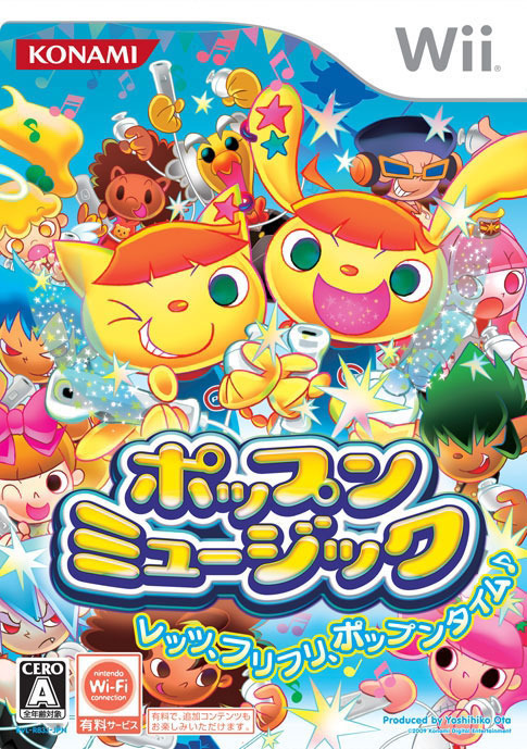
I’ve noticed an interesting trend with Japanese game covers – they tend to feature more characters than the NA/EU counterparts, making them feel more “cluttered” in comparison. I wonder why that is?
Next up is the North American cover:
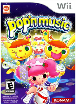
Now the NA cover is clearly using the same art of the two yellow animal characters, Mimi (the bunny) and Nyami (the cat), but aside from that, the layout differs significantly. I find it strangely telling (of something, I’m not quite sure what) that the NA cover puts much more emphasis on the humanoid female character with pink hair than the Japanese cover does. Mimi and Nyami are actually the series mascots, whereas the pink-haired girl is hardly a “main” character, from what I’m aware, so I feel her inclusion here is purely based on her character design. At least the Japanese cover also features some series regulars such as Mary, the girl with the afro in the bottom left corner.
Finally, we have the European cover:
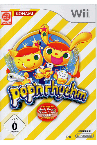
Now this is a very different approach to the cover art than we saw in the Japanese and NA versions. The base image of Mimi and Nyami is the same, and the logo, though now Pop’n Rhythm instead of Pop’n Music, is neigh on identical to the NA version. But why the decision to go with a striped, minimalist background and additional text indicating what artists are included? Believe it or not, I generally find that Europe gets the most “minimalist” or “artsy” of cover designs when it comes to games, but I’m not sure why that is.
So, which cover is your favorite? I went into this post thinking I was going to say the European version, no question, but the more I look at the Japanese version, the more it’s growing on me. I like the variety of characters and the more colorful palette, and the logo is much more appealing. I still really dig the yellow stripes on the European cover, though! The NA one, however, is all kinds of yuck for me. I just don’t understand why they felt the need to go with the disco feel or add that cake in between Mimi and Nyami.
While you’re thinking about which is your favorite, do consider for a moment why the different covers might vary so significantly between regions! I personally really enjoy hypothesizing what the differences say about the perceived tastes of the different markets Konami is trying to appeal to.
If you’re looking for more box art analysis, be sure to check out The Gay Gamer blog! Bryan’s ‘Which Box Art is Better?’ series looks at a wide range of titles, including new releases.
I liked that beep boopy rhythm game where you had to play piano or something? There were lots of buttons and it was super difficult but kinda cool if you were a pro… or watched a pro :p
Well, you know I’m always up for a conversation about box art, Anne 🙂
As for the box art produced for this particular game: I like the Japanese art best myself. Sure, it’s kind of crazy, but it also has more “energy,” for lack of a better word, than the NA and EU box arts, IMO.
The other two options are kind of boring in comparison. I like that they include the series’ adorable mascots, but other than that I don’t find them all that appealing.
BTW, I’m really curious to hear the name of the game Alois brings up in the comment above!
I can try and track down the game, Bryan. There’s an arcade right next to my work so I’ll have a look around to see if it’s still there tomorrow.
Alois – Yeah, I’m curious to know what game you’re talking about, too! Take some pictures if it’s still there 😀
Bryan – I’m glad you are! I need someone to kabitz about artwork with 😉
I definitely agree with you about the energy in the Japanese cover. I still have a soft spot for the EU one, but I think I like it much better overall. I think even the colors in general are growing on me.
If you can explain to me why the US cover felt the need to put a cake and the pink haired girl in the center, I’m all ears! 😉