The other day, I happened to be browsing the shelves of my local game store (as one does), and I happened upon a curious sight. See, when you’re as obsessive about stopping by the game store every time you go out as I am, you generally know what to expect, so a box that looks out of the ordinary usually jumps out right away. Well, in this case, I was blown away by how appealing a certain game cover looked…
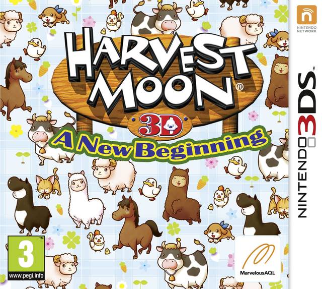
Why, it’s Harvest Moon 3D: A New Beginning! But instead of the ugly anime boy and girl on the Japanese and North American covers, this one’s covered in an adorable farm animal pattern! I must admit, I’m a little disappointed at the fact that I already own the North American version, as I totally would buy this one for the cover alone! Yes, the Harvest Moon logo itself is still garish and horrible, but I definitely think the European cover of Harveset Moon 3D: A New Beginning is a major step up. Here’s the North American version:
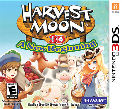
Oh look, some farmers and animals. Something really irks me about this illustration style! The animals themselves are cute and all, but their pastel shading style (which I prefer, actually) totally clashes with the darker colors used on the boy and girl in the foreground. Though the Japanese cover uses much of the same assets, it’s a definite improvement:
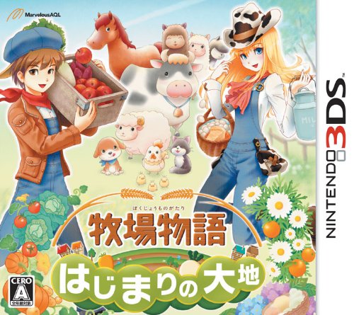
The logo still isn’t the greatest game logo I’ve ever seen, but it’s still a huge step up from the English Harvest Moon logo. The characters also look like they fit into the overall image more, which has me convinced that they decided to amp up the saturation for the North American cover for whatever reason. My favorite part about the Japanese cover, though, is that the logo is located at the bottom and is surrounded by all sorts of lovely flowers and vegetables!
It’s not usually the case, but I think this time the European cover steals the show for having the best design, with the Japanese cover coming in at a close second. I have a feeling I may be in the minority, though, especially since there are definitely some weird things about it, but basically it comes down to the fact that I just adore patterns and cute animals. Now, this reminds me that I should finally dig into my copy of the game…
If only the Euro box art featured a logo that was a bit softer like the Japanese one–it would be perfect! As it stands, though, I like the Japanese art best. The NA art is the worst, by far, due to it containing both the terrible logo and some over-saturated humans. Ugh.
The Japanese logo is definitely the best. It’s much nicer than the American/European logo. But I have to agree, I think the European box art is definitely the best. It’s completely adorable!
Michelle
I picked up the Euro version just the other week and I agree that the box art is immensely appealing. It did, in fact, seal the deal for me since I was considering not buying it at all (two towns was a bit of a disappointment).
Glad I did grab it because wow is the game itself a return to form for HM.
I know what you mean – I think my main complaint about the European cover is that it does seem a little over-saturated, as well. I also quite like the Japanese cover, so I’ll let you off the hook for not agreeing with me this time 😉
I haven’t had much time to play it, especially since I picked it up when I was still overcome with Animal Crossing fever, but what little I’ve played definitely seems great!
Ha! Well, thanks for letting me off the hook–even if only this once 😉